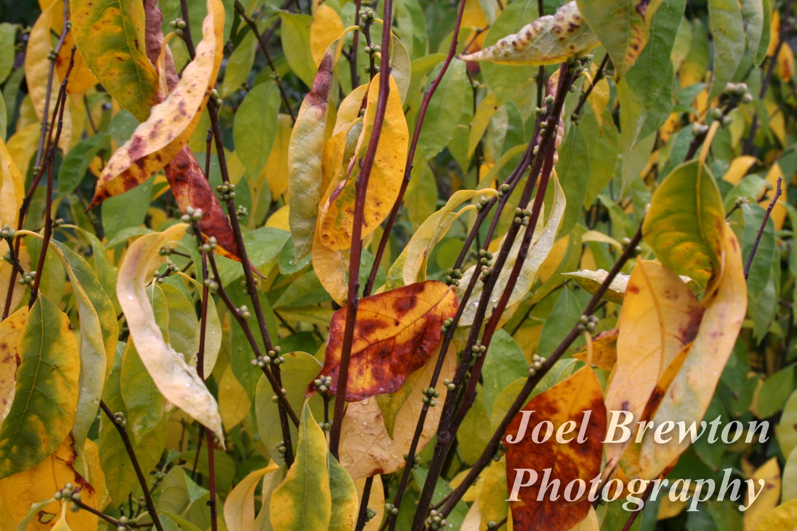
OK, here goes: The LIGHTING photos--both have the focus on the flower foreground, and both blur the background so that's good, however, the rose is alost translucent, it does a CONTRAST of the petal as almost luminiscent while the purple flower doesn't. THE COLOR: I'd like the orange "truck" to be crisper, more gloss, "harder" to contrast with the gray of the sky. The gray is almost too white to be GRAY, and doesn't play on the other side of the texture of the metal to make a strong contrast, (That's just my opinion) The fall--wow, light, focus, colors. A the colors are distinct, strong, contrasting, well lit. Wow.
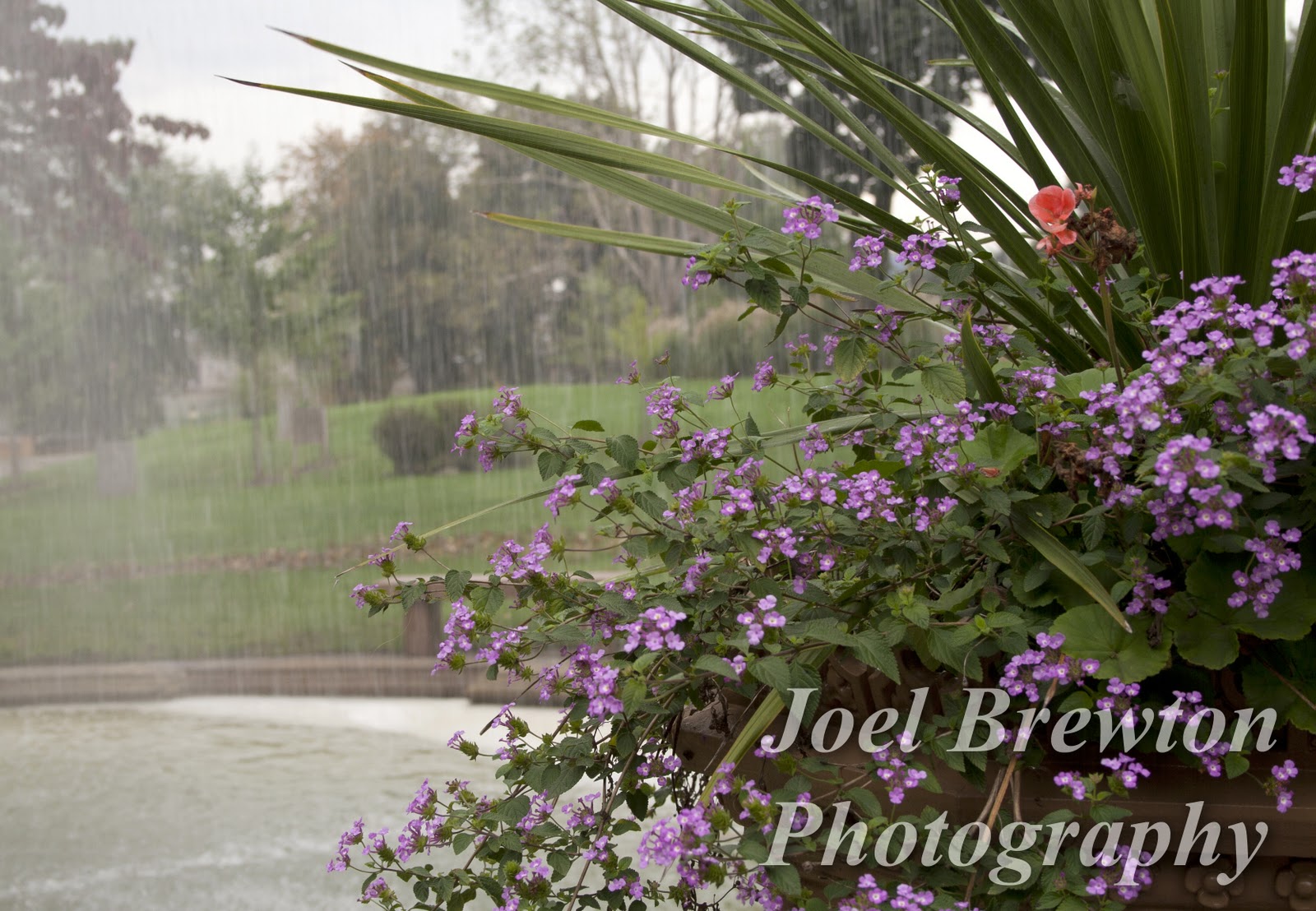
Bokeh. I have no idea what BOKEH is, but here goes an opinion. The pipe looks good to me. The rain and flower looked Photoshop-ed to me but I didn't know why. It just looked fake, then I noticed that the sky that is seen in the upper right corner, over the red flower is clear and it's not raining. MOTION: don't ask me. I think this is me, older, not great vision.
ABSTRACT. The second one has more appeal to me. I like th sharpness of it all. The next three--OMG, I love them. The street---I love it but don't know why. The sky, once again, for my taste could be in sharper contrast and have more impact. The autumn scene--wow. The panorama---wow wow lau lau. Great phtos, Joel. Congrats. Now on to the Pulitzer.


OK, here goes: The LIGHTING photos--both have the focus on the flower foreground, and both blur the background so that's good, however, the rose is alost translucent, it does a CONTRAST of the petal as almost luminiscent while the purple flower doesn't. THE COLOR: I'd like the orange "truck" to be crisper, more gloss, "harder" to contrast with the gray of the sky. The gray is almost too white to be GRAY, and doesn't play on the other side of the texture of the metal to make a strong contrast, (That's just my opinion) The fall--wow, light, focus, colors. A the colors are distinct, strong, contrasting, well lit. Wow.
ReplyDeleteBokeh. I have no idea what BOKEH is, but here goes an opinion. The pipe looks good to me. The rain and flower looked Photoshop-ed to me but I didn't know why. It just looked fake, then I noticed that the sky that is seen in the upper right corner, over the red flower is clear and it's not raining. MOTION: don't ask me. I think this is me, older, not great vision.
ReplyDeleteABSTRACT. The second one has more appeal to me. I like th sharpness of it all. The next three--OMG, I love them. The street---I love it but don't know why. The sky, once again, for my taste could be in sharper contrast and have more impact. The autumn scene--wow. The panorama---wow wow lau lau. Great phtos, Joel. Congrats. Now on to the Pulitzer.
ReplyDelete